The Heatmap is the view that lets you compare, on a single screen, the scored results of your survey or Engagement Meter across several populations (departments, locations, SmartGroups…). Thanks to a simple color code, it helps you spot your strengths and areas of concern at a glance.
You access the Heatmap from the results page of each campaign, next to the Detailed Results and Diagnostic tabs.
🧱 What is the Heatmap?
The Heatmap displays a cross-referenced table:
- In columns: the populations you want to compare (for example your different Departments, sites, or teams).
- In rows: the scored questions from your survey, grouped by theme if you have configured any.
- In each cell: the score obtained by that population on that question, colored according to its level (🟩 ⬜️ 🟥).
Specifically, it allows you to:
- effortlessly compare your organizational entities or populations with each other;
- structure the analysis of your results by theme, with an associated score;
- quickly identify at-risk areas and topics;
- get a reporting format that's easy to share with your teams and leadership.
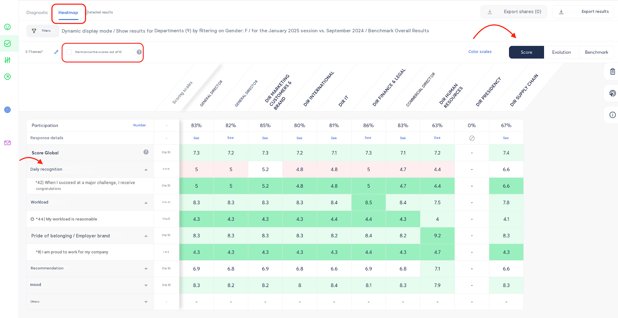
👉 All scored questions in your template display on the original scale chosen when configuring your survey. However, you also have the option to harmonize all your scores onto a single 0 to 10 scale so they remain comparable with each other (with the exception of the eNPS question, which stays on a -100 to 100 scale).
How is this harmonization to 10 calculated?
Whatever the original scale of your question (/5, /7…), the score is brought back to 10 using the following formula:
(score obtained − scale min) / (scale max − scale min) × 10
For example:
- A score of
4on a1 to 7scale:(4 - 1) / (7 - 1) = 0.5, i.e.5/10.
- A score of
4on a0 to 5scale:(4 - 0) / (5 - 0) = 0.8, i.e.8/10.
👉 This harmonization is what allows the Heatmap to display, side by side, questions originally rated on different scales, without distorting the comparison.
If a Global Score has been configured on your session (based on a selection of scored questions defined when building the survey), it is displayed as a dedicated row in the Heatmap, below the Global Score row.
🔎 How to read the Heatmap: the strength of dual reading
This is what makes the Heatmap so powerful: you can read it in two directions, and combining both is the fastest way to spot weak signals.
- Vertical reading (column by column): for a given question or theme, you compare the scores obtained by each of your populations. This lets you immediately see which Department, site, or team stands out, positively or negatively, on a given topic.
- Horizontal reading (row by row): for a given population, you scan through all its results across the different questions or themes. This lets you identify its own strengths and areas of concern.
💡 Tip: always cross both readings. An isolated red cell in a row may simply reveal a one-off topic for a given population, while an entire column trending red may reveal a broader risk area that should be addressed as a priority with that population.
🎨 The score color code
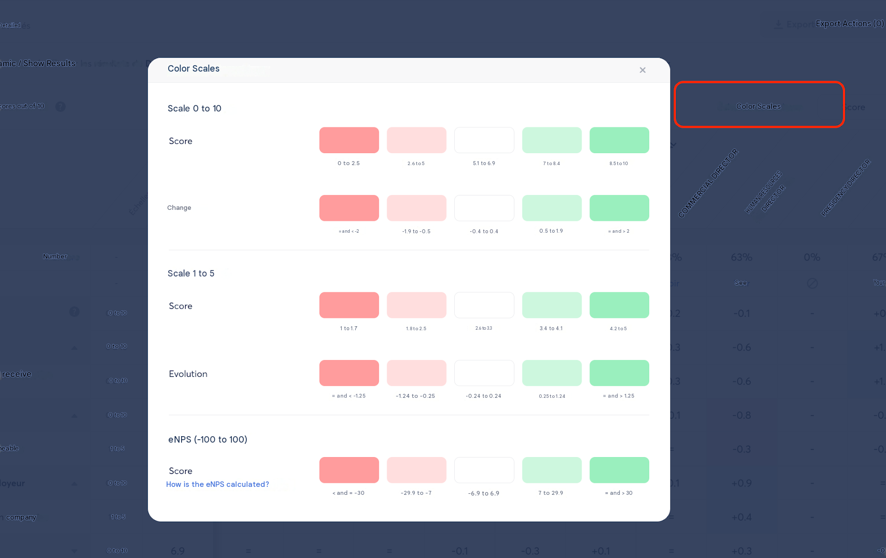
To give you an immediate reading, every score displayed in the Heatmap is colored according to the following thresholds:
| Color | Score out of 10 | Interpretation |
|---|---|---|
| 🟥 Red | 0 to 5 | Result to prioritize |
| ⬜️ Grey | 5.1 to 6.9 | Intermediate result, potential area for improvement |
| 🟩 Green | 7 to 10 | Result to highlight |
This color code is the same one used on the detailed results pages and on the Diagnostic page: you'll always find the same reading, wherever you are in your campaign analysis.
[Screenshot]
🗂️ Structuring your analysis by theme
To go further in your reading, you can associate a theme with your scored questions (for example: Workload, Autonomy, Sense of belonging…).
- An average score out of 10 is then automatically calculated for each theme.
- Scored questions that aren't associated with any theme are grouped into an Other category.
- You can use Zest's ready-to-use QVCT (workplace wellbeing) theme library, or create your own themes.
Associating a theme with a survey that has already launched: From the Heatmap page, open the theme-editing pop-up to change the association on the selected session. You can also go through the survey editor: in that case, the change will apply to future sessions.
⚖️ Comparing two sessions: the Evolution view
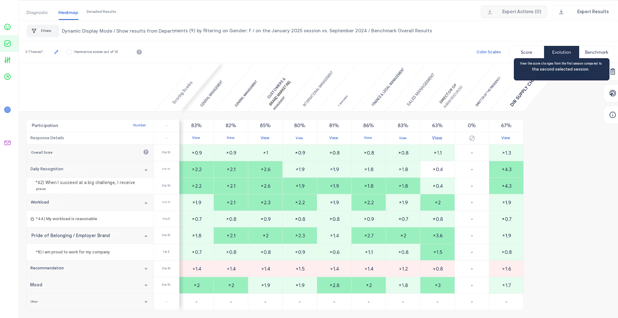
If your survey includes several sessions, you can visualize how your scores have evolved between two of them.
- You can select one or two sessions in the filter panel. The Evolution view is only available when two sessions are selected.
- By default, the two most recent sessions are selected, but you can freely choose any other session to compare, with no chronological constraint.
- The gap shown always corresponds to the score of the first selected session relative to the second.
- Hovering over a cell in Evolution mode displays the reference score (first session).
👉 The All sessions option is not available for this view: comparison is only possible between two distinct sessions, in order to keep the reading clear.
📏 Positioning against a reference: the Benchmark
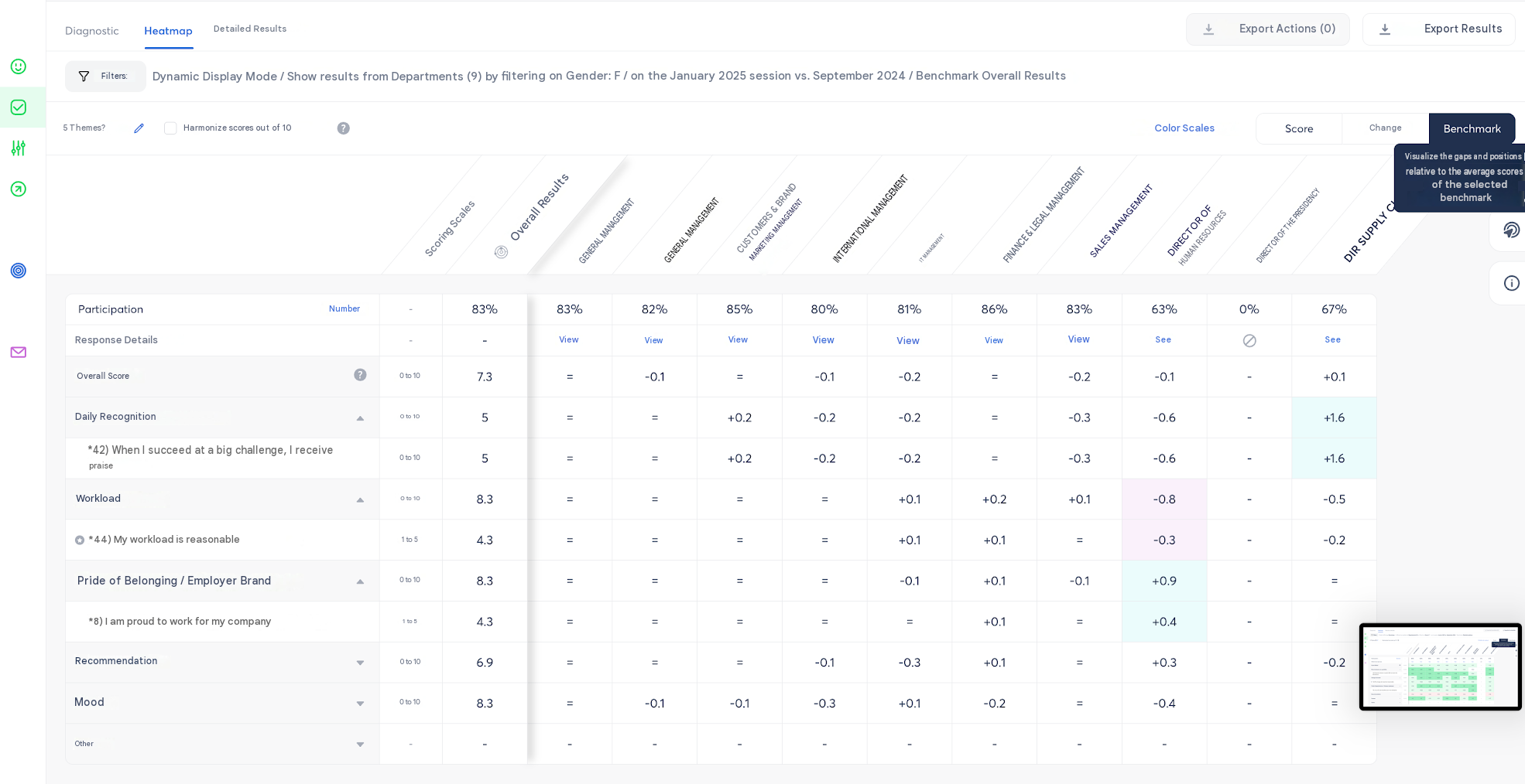
The Benchmark view lets you compare the scores displayed in the Heatmap against a reference of your choice:
- My entire scope
- Global results
In this view, a fixed column displays the average scores of the selected reference, and the other columns show the gap between their score and that reference: a positive gap means a result above the reference, a negative gap means a result below it.
👉 This display mode replaces the former "Delta / Global" mode, now named Benchmark in the interface.
🔍 Combining your filters to refine your analysis
This is the feature that multiplies the power of the Heatmap: the ability to combine several filters to refine the population you're analyzing.
The available filters, accessible from the Filters button, are:
- Departments
- Locations
- SmartGroups
- Managers
- Custom attributes (e.g.: gender, contract type, seniority, job function…)
Multi-population comparison in columns: From the Filter tab, go to The following populations, then click Customize selection to choose the populations you want to compare in columns.
Combining with an attribute: You can now stack several attributes to refine the population being analyzed — for example job = support + contract = permanent + gender = female.
👉 Concrete example: you want to compare the results of all your Departments, but only for the female population. To do this:
- Open the Filters panel.
- Select your Departments as the populations to compare in columns (via Customize selection).
- Add the filter by clicking Add a filter, using the attribute Gender = Female, on top of your selection.
- The Heatmap updates automatically: each column now shows the results of your Departments, calculated only among female employees.
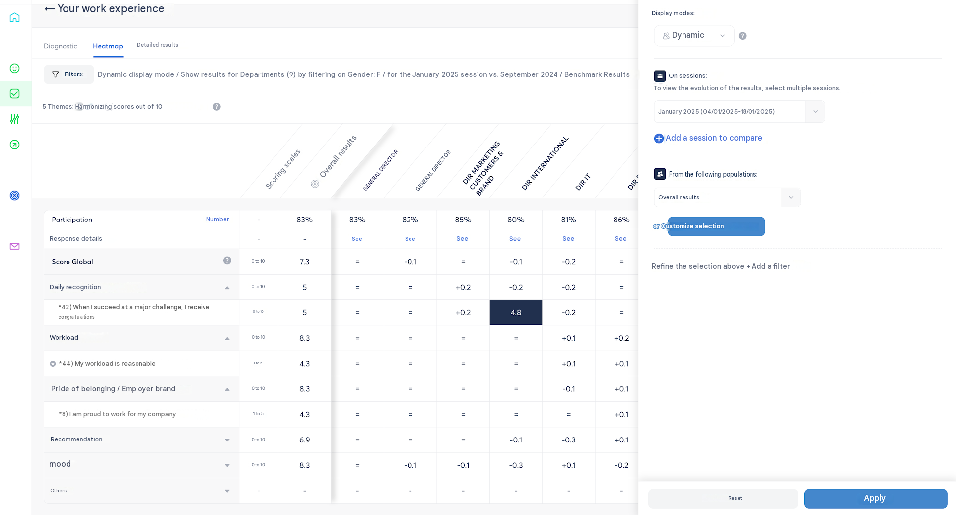
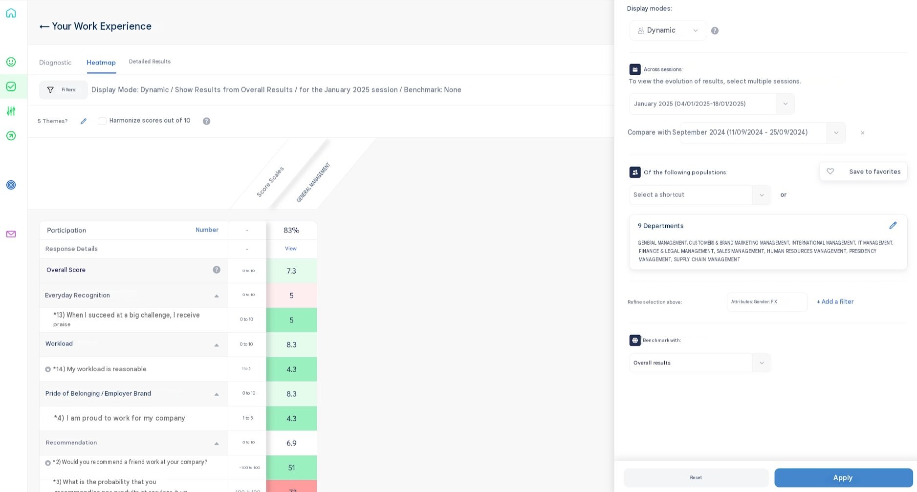
👉 This filter-stacking system works exactly the same way on the Heatmap as on the Diagnostic page or the Detailed Results page: you can therefore apply the same combination logic, regardless of which analysis screen you're on.
📥 Exporting your Heatmap
Once your analysis is built (populations compared, filters combined, themes displayed), you can export a complete replica of your Heatmap in Excel format.
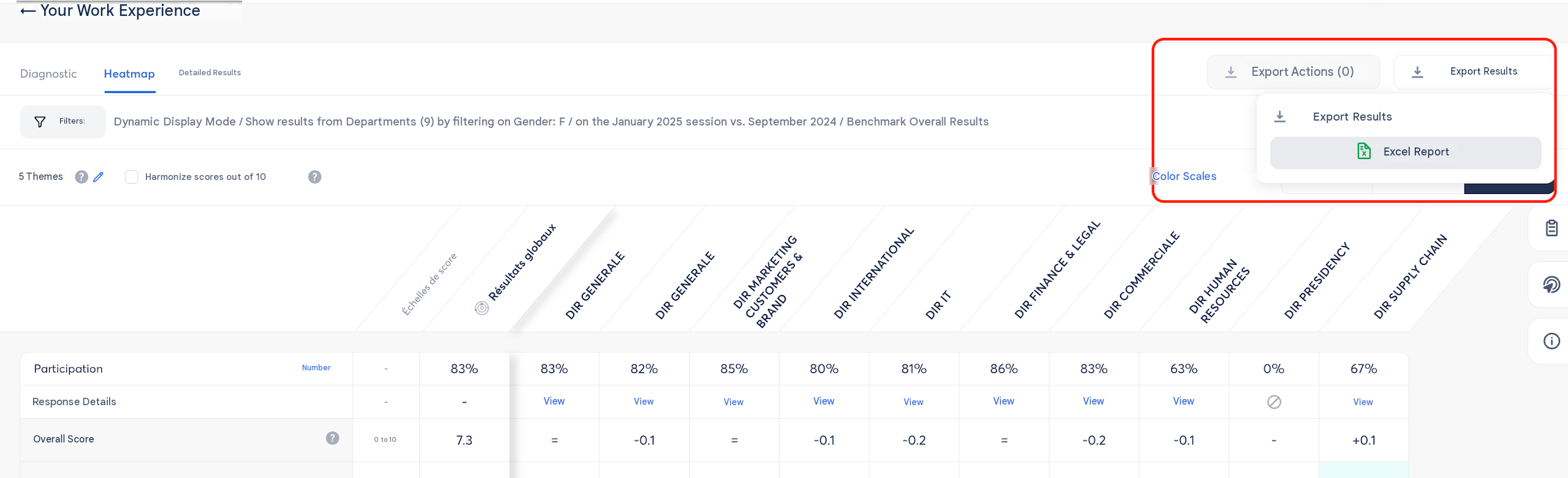
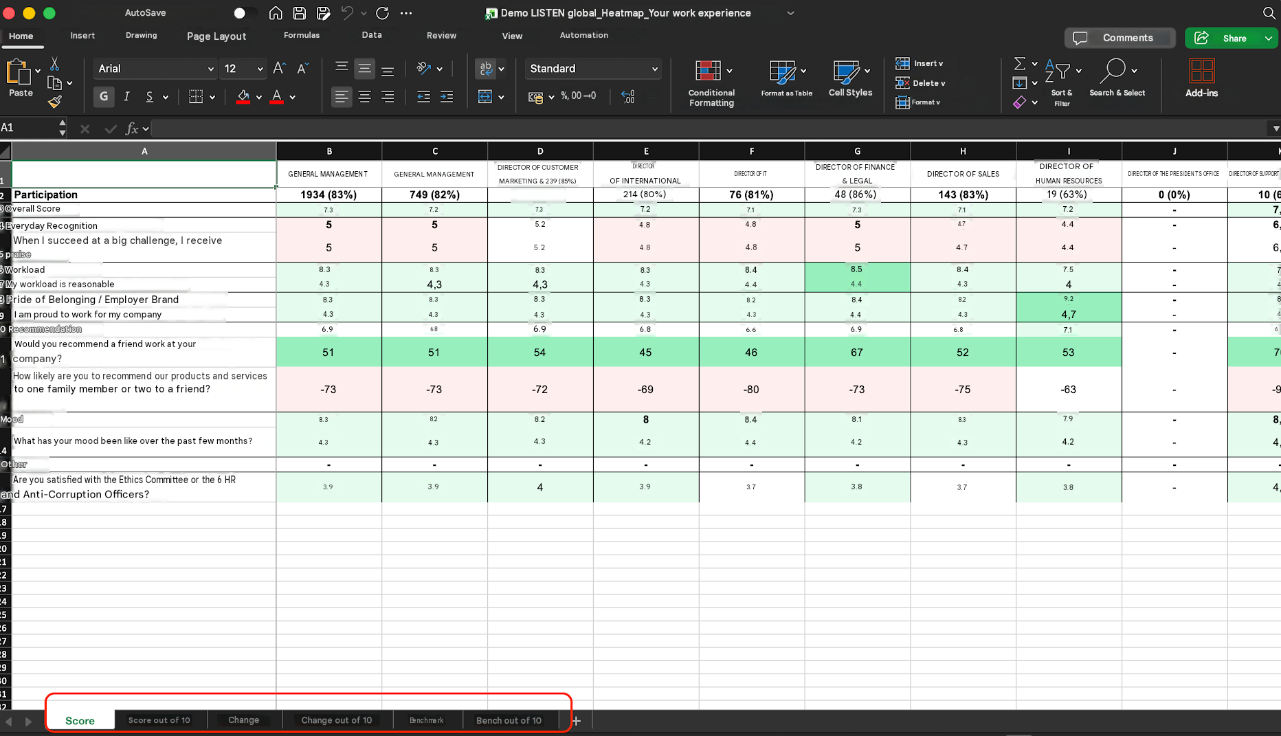
The export contains 3 tabs, or 6 tabs if you've harmonized your scores to 10 (one set of tabs for the original scale, a second set for the harmonized /10 scale), mirroring the 3 views available on screen:
| Tab | Content |
|---|---|
| Score | Average result per population and per question |
| Evolution | Score comparison between two sessions |
| Delta | Positive or negative variations from one session to the next |
👉 This format is particularly useful for analyzing trends over time, comparing your populations outside of Zest, or feeding into your QVCT (workplace wellbeing) reports and People Reviews.
🔗 Go further
👉 Also discover these articles: