🧭 How does the Diagnosis page work for your surveys?
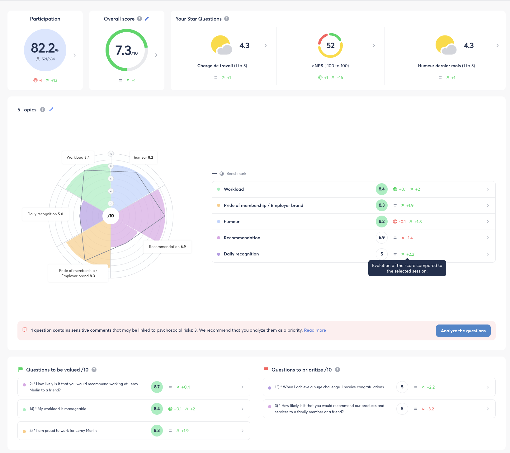
The Diagnosis page is a new summary view available on your survey campaigns. It brings together the key indicators — participation, overall score, themes, key questions — on a single screen, letting you quickly identify your organization's strengths and areas for improvement without navigating between several results screens.
This article explains how to access it, what you'll find there, and how to interpret each indicator.
🧱 What is the Diagnosis page?
The Diagnosis page offers a quick, actionable read of your survey results. It highlights:
- key indicators (participation rate, overall score, star questions);
- a theme-based view as a radar chart and a table;
- a Top & Flop of the strongest and weakest questions;
- an alert on sensitive comments detected in open-ended answers.
It is accessible to all roles with read access to results for the survey.
👉 It complements the Heatmap and Detailed Results tabs, already available on your survey campaigns.
🔐 Prerequisite – Activating the Diagnosis page
🔴 Temporary point, to be removed from the article once the rollout is complete — confirm with the product team the planned date for making it available to all customers.
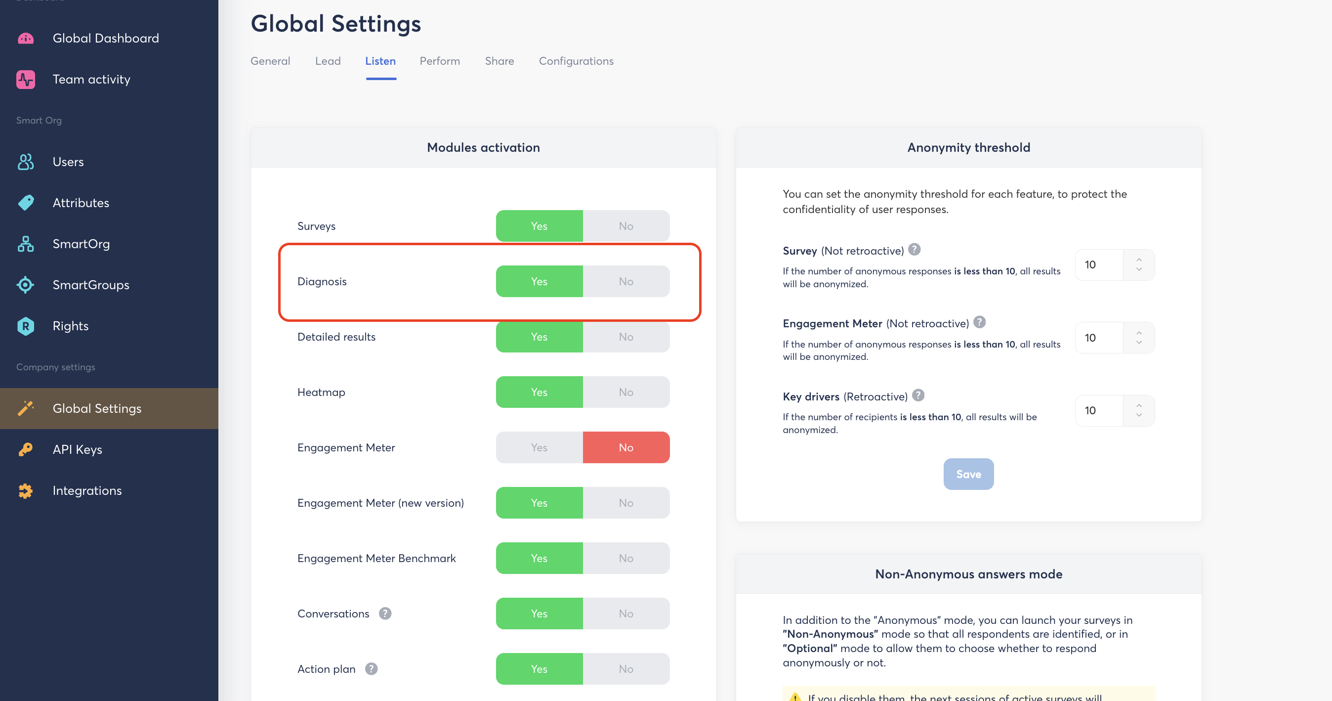
During the phased rollout, the Diagnosis page must be manually activated from the Back Office:
- Log in to Zest.
- Go to Global Settings.
- Click the Listen tab.
- In the Modules activation block, find the Diagnosis row.
- Select Yes, then click Save.
🚀 Accessing the Diagnosis page
Step 1 – From your survey campaign list
- Log in to Zest.
- Go to the Survey module.
- Find the relevant campaign in the list, click on Analyse
- On the campaign card, click the Diagnosis button up to your page, just near heatmap and detailed results
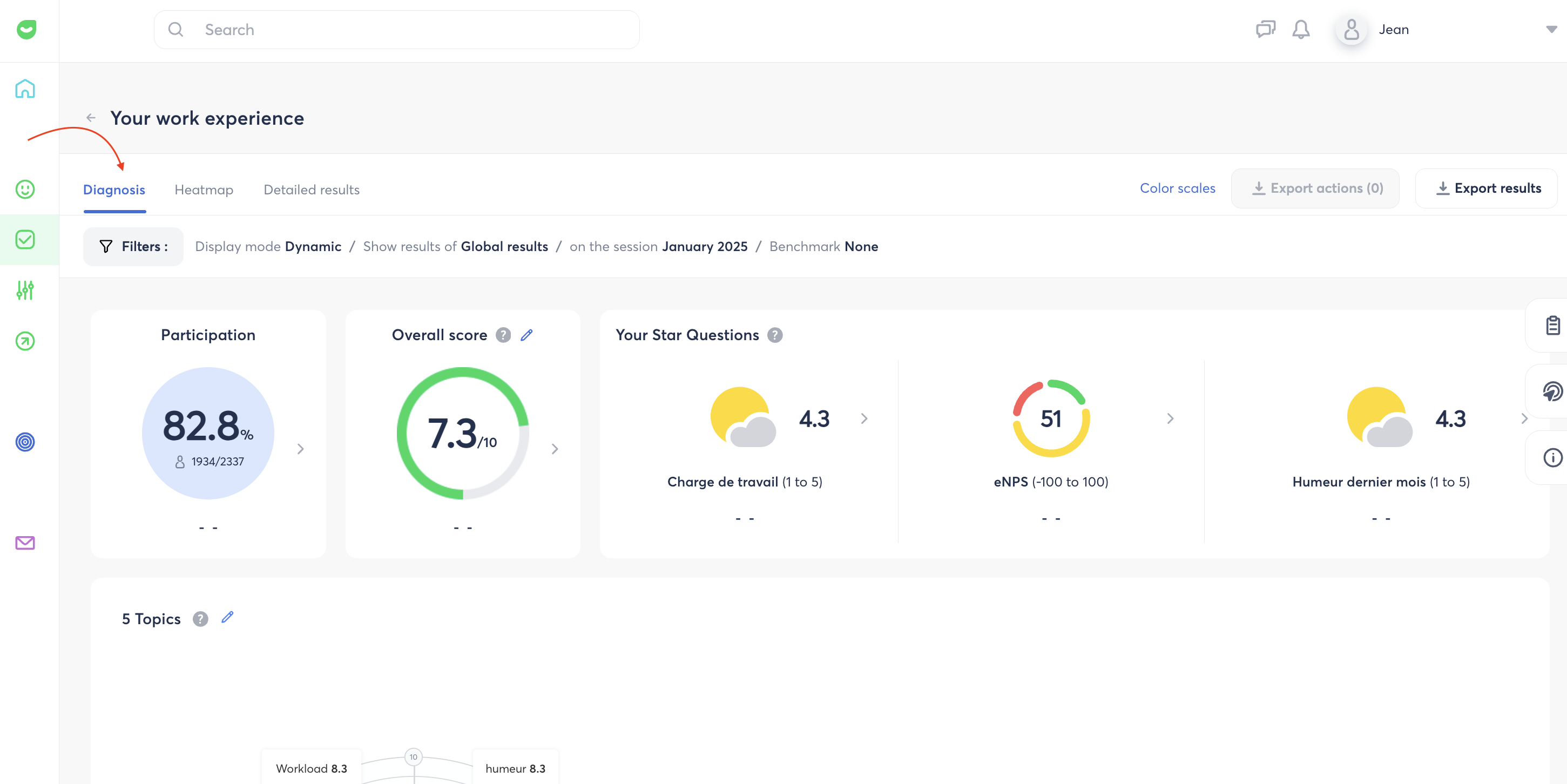
💡 Tip: the Analyze button takes you to the classic detailed results, while Diagnosis opens the summary view directly.
📊 Key indicators
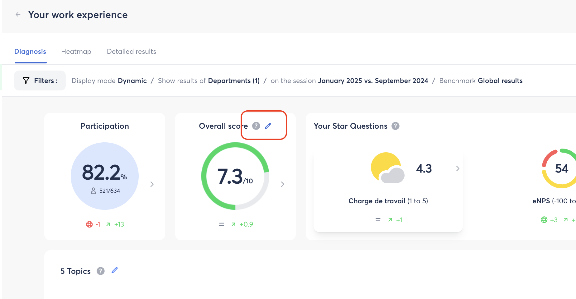
Once your campaign's data is complete, the Diagnosis page displays three main indicators:
| Indicator | Description |
|---|---|
| Participation | Response rate and number of respondents out of the targeted headcount |
| Overall score /10 | Average calculated from the selected scored questions |
| Star questions | eNPS, weather, trust climate… depending on which are enabled in the template |
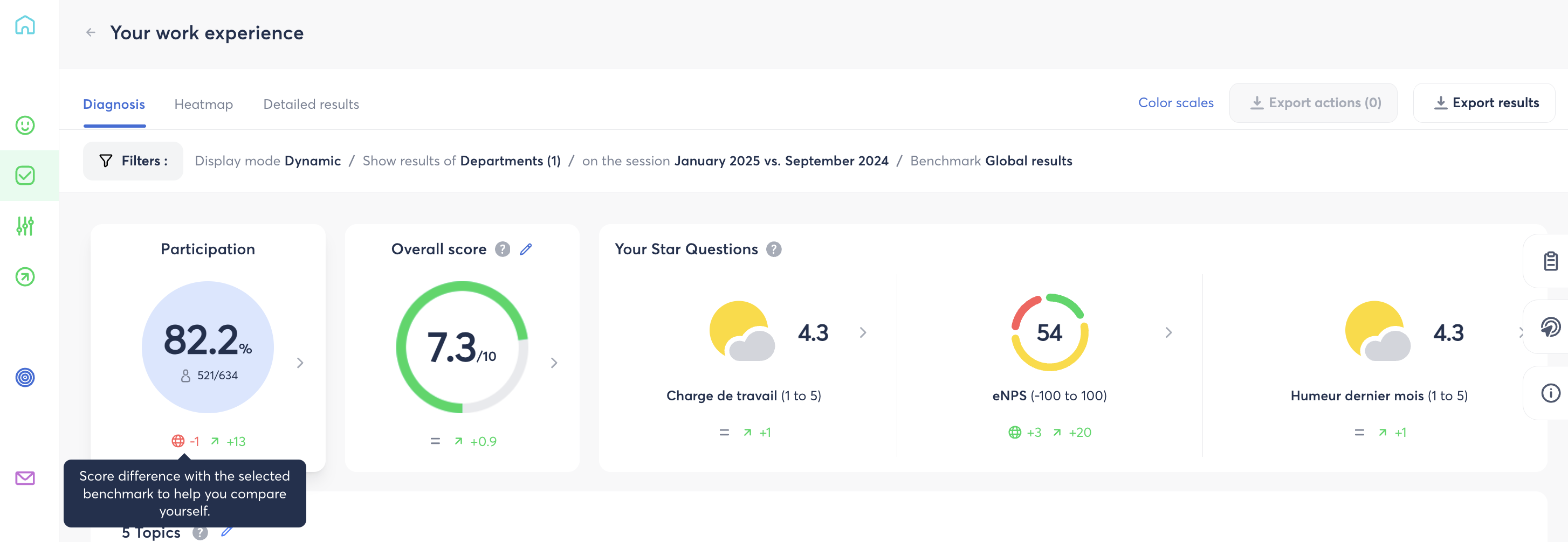
Each indicator can display up to three additional insights, if enabled and applicable to your scope:
| Insight | What it means |
|---|---|
| 🌐 Benchmark | Gap between the result of your filtered scope and the selected Benchmark |
| ↗️ Evolution | Gap between the results of the 1st and 2nd selected sessions |
| ⚠️ Gaps | Flags a significant spread in responses within the scope |
How is the "Gaps" indicator triggered?
| Question scale | Trigger threshold |
|---|---|
| 1 to 5 | Gap between two scores > 0.5 |
| 1 to 10 | Gap between two scores > 1.1 |
⚙️ The Overall score: what you need to know
The Overall score is an average calculated on a 10-point scale, based on the scored questions you choose to include in the calculation.
You can customize it:
- On the Overall score card, click the pencil icon ✏️.
- In the Configure the Overall score window, select the eligible scored questions by clicking Add.
- Click Save.
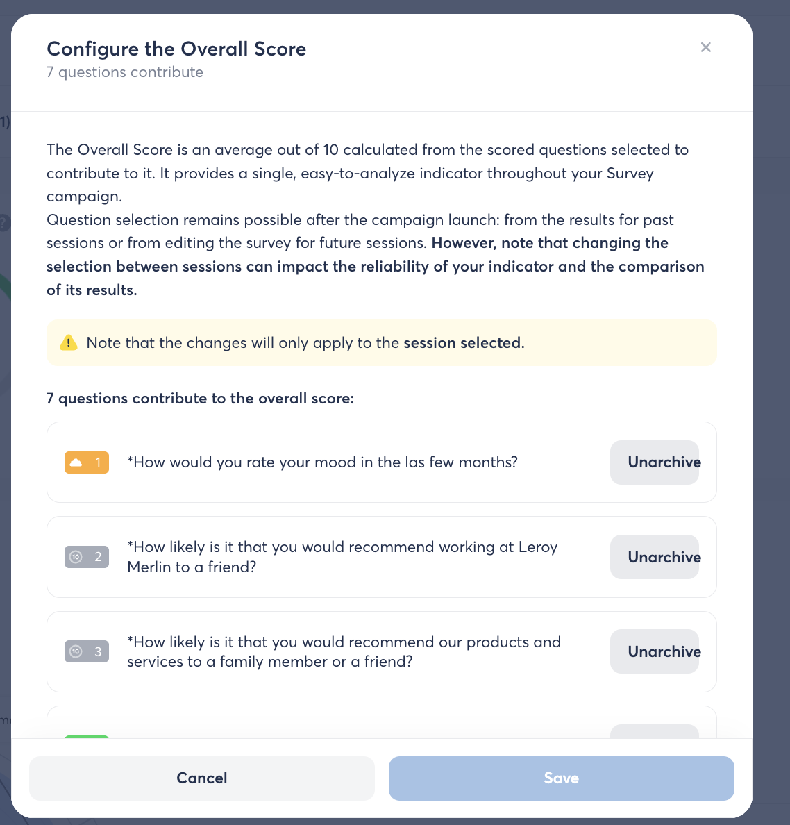
⚠️ Caution: changing the selection of questions affects the reliability of the Overall score and its comparability across sessions. If an Overall score was already configured for the session, a confirmation pop-up appears before saving. Also note that these changes only apply to the selected session: to change the Overall score for future sessions, you need to edit the survey when you build it. What is a partial Overall score?
An Overall score is considered partial when some of the questions it's made of have hidden results (anonymity threshold not reached) or simply have no result at all. Hidden results are not included in the calculation — which is why the score is considered partial.
👉 We recommend being cautious when using a Partial score: it is less representative and less comparable to a complete score.
👉 For a detailed step-by-step configuration guide, see the dedicated article: [How do I configure the Overall score of my surveys?]
🧩 The theme radar and table
How do you read the theme radar?
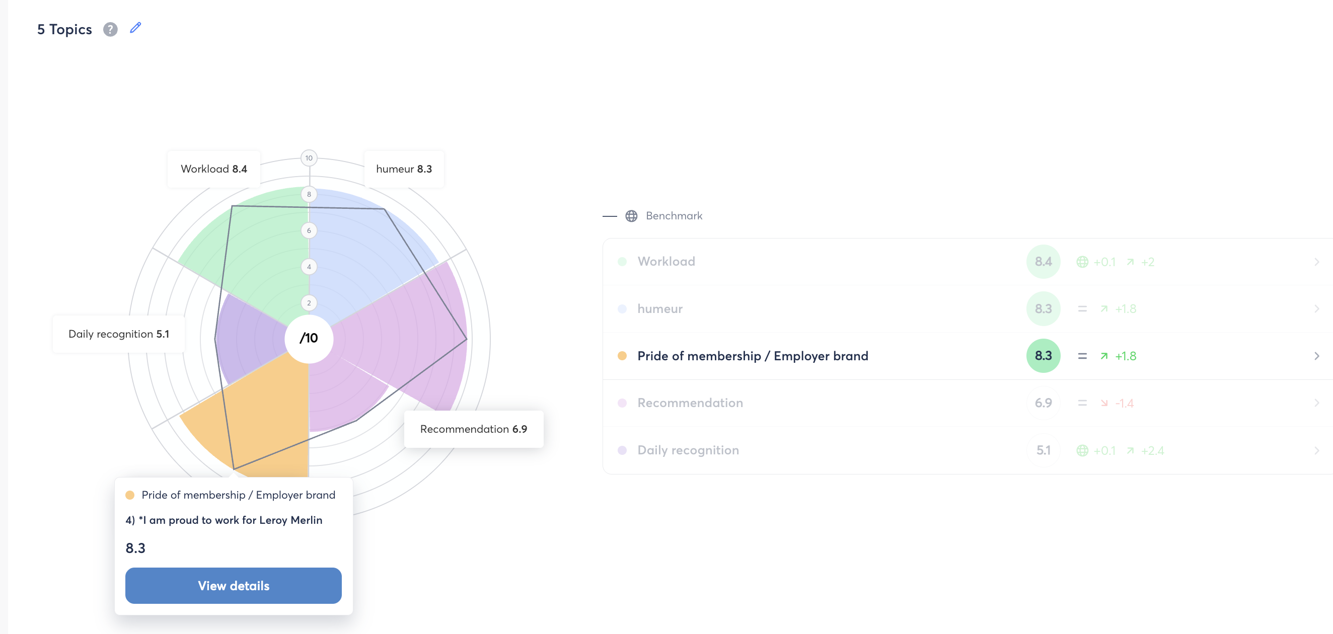
The radar gives a visual representation of your survey's themes and the questions that make them up:
- each bar corresponds to a question;
- the bar's height represents its average score, recalculated on a 10-point scale to stay comparable across questions;
- the color represents the associated theme.
Hovering over a bar shows a tooltip with the question's title, its average score, the Benchmark / Evolution / Gaps indicators, and its theme.
⚠️ Three conditions to know:
- only scored questions associated with a theme appear in the radar;
- your template must have at least 2 themes with scored questions for the radar to display;
- all scores are recalculated on a 10-point scale, even if the question was originally rated on a different scale.
What is the theme table for?
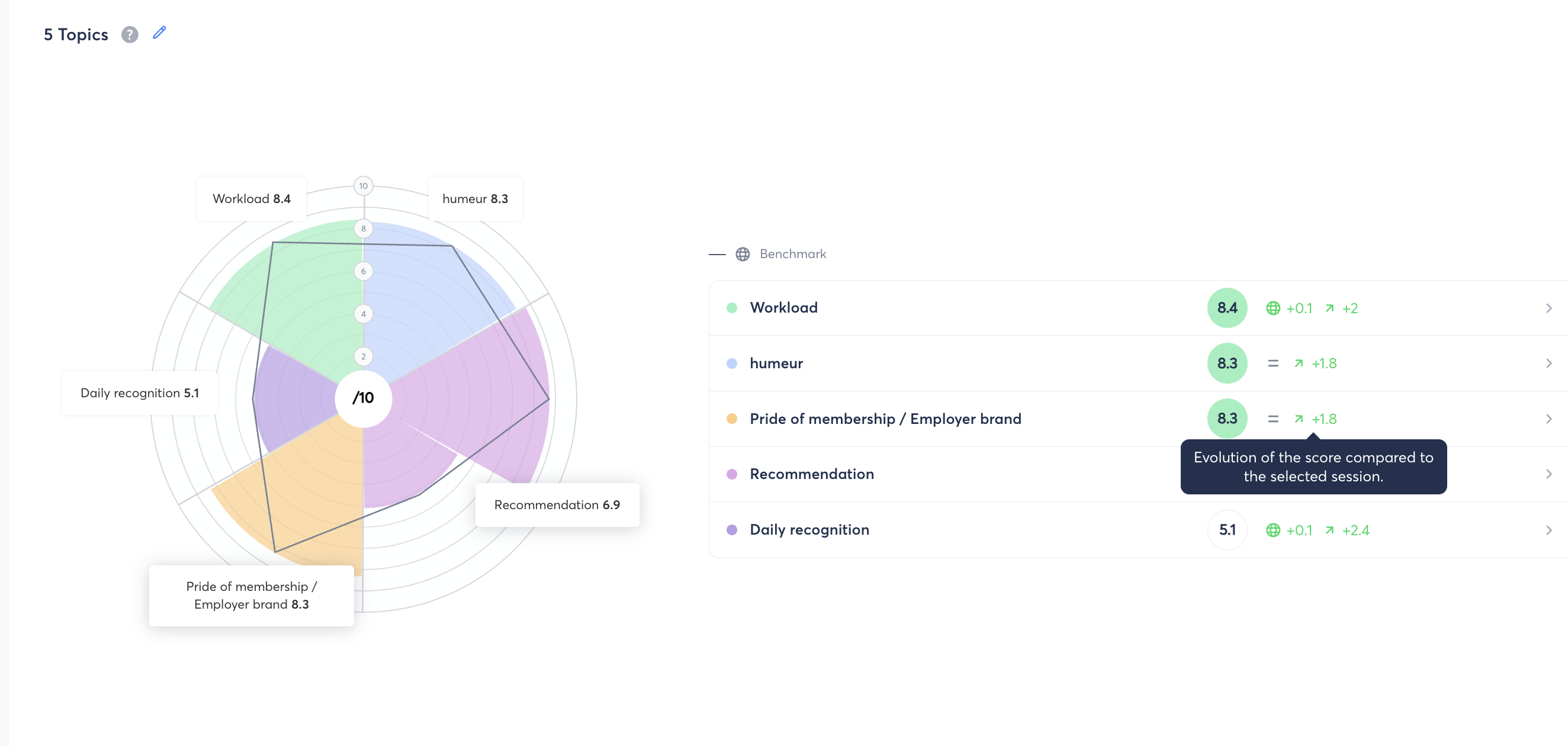
The table lists, for each theme, its average score along with its Benchmark / Evolution / Gaps indicators. Themes are ranked from the best score to the lowest. It complements the radar: hovering over a question's bar highlights the corresponding theme in the table.
🚩 The sensitive comments banner
When open-ended comments containing signals potentially related to psychosocial risks are detected, a warning banner appears above the Top & Flop of questions. It shows the number of questions concerned and offers an Analyze the questions button, which takes you to the Detailed Results page.

👉 To learn more about how sensitive comments are detected, see the article: [How are sensitive comments detected in your surveys?] (article coming soon)
🏆 The Top & Flop of questions
This section highlights:
- 🟩 Questions to highlight /10: the 3 scored questions with the best results (above the median);
- 🟥 Questions to prioritize /10: the 3 scored questions with the weakest results (below the median).
All scored questions in the template are analyzed, whether or not they're associated with a theme.

🎨 Understanding indicator colors
The colors shown on scores and indicators follow standardized scales, also available from the Color scales link at the top of the Diagnosis page:
| Indicator | 🟥 Red | 🟨 Yellow | 🟩 Green |
|---|---|---|---|
| Overall score (0 to 10) | 0 to 4.9 | 5 to 6.9 | 7 to 10 |
| Theme & Question (0 to 10) | 0 to 4.9 | 5 to 6.9 | 7 to 10 |
| Question (1 to 5) | 1 to 2.9 | 3 to 3.9 | 4 to 5 |
| Evolution | ≤ -20% | -19% to 19% | ≥ +20% |
| Benchmark | Bottom 20% | Average | Top 20% |
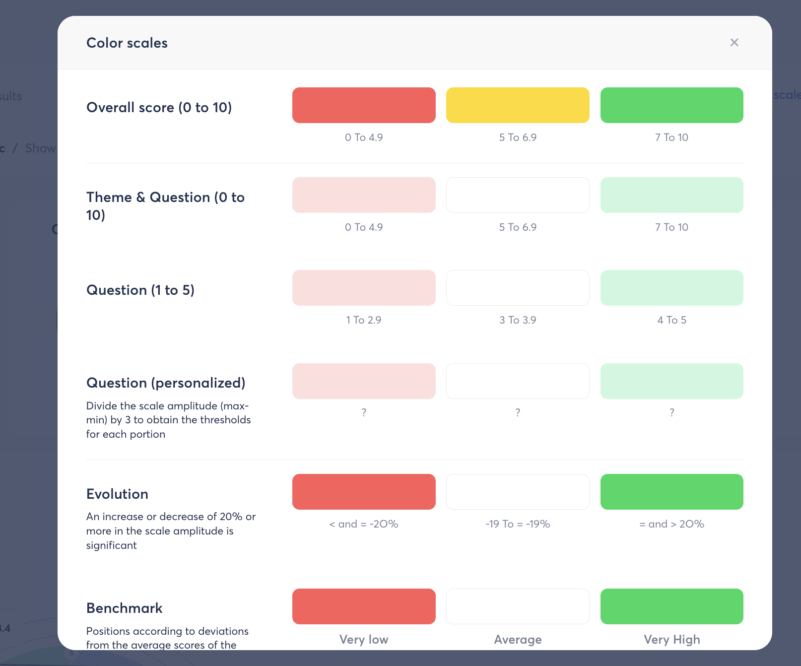
ℹ️ For a question with a custom scale, thresholds are calculated by dividing the full range of the scale (max − min) into 3 equal portions.
🔍 New filtering options
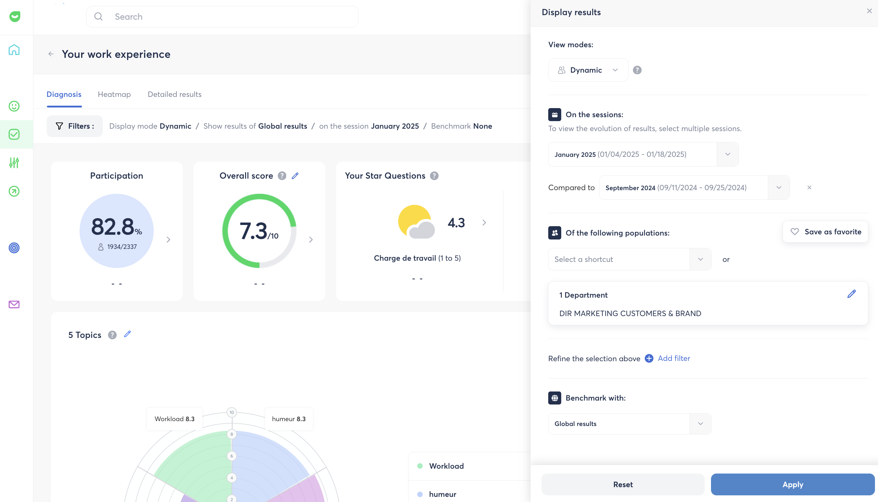
The Diagnosis page expands the filtering options available on your results:
- Display results for your entire managed scope (teams, departments, and/or locations combined).
- Display an internal benchmark (score gaps) compared to Global Results or to your entire scope.
- Display the evolution between two sessions of your choice.
- Combine several attributes to refine the population analyzed (e.g., job = support + contract = permanent + gender = female). Previously, only one attribute could be applied at a time.
- Filter results based on answers to star questions (e.g., view the results of employees who answered "Stormy" to the weather star question, or "promoter" profiles on the eNPS question).
🔗 Learn more
👉 You may also be interested in these articles:
- [How do I configure the Overall score of my surveys?]
- [How are sensitive comments detected in your surveys?] (coming soon)
- [How do I export survey results in Excel format?]
- [How do I generate a PowerPoint export of my survey results?]
- [How does the Heatmap & Benchmark work?]