The heatmap with themes to analyze your surveys
A new, simple and actionable analysis tool
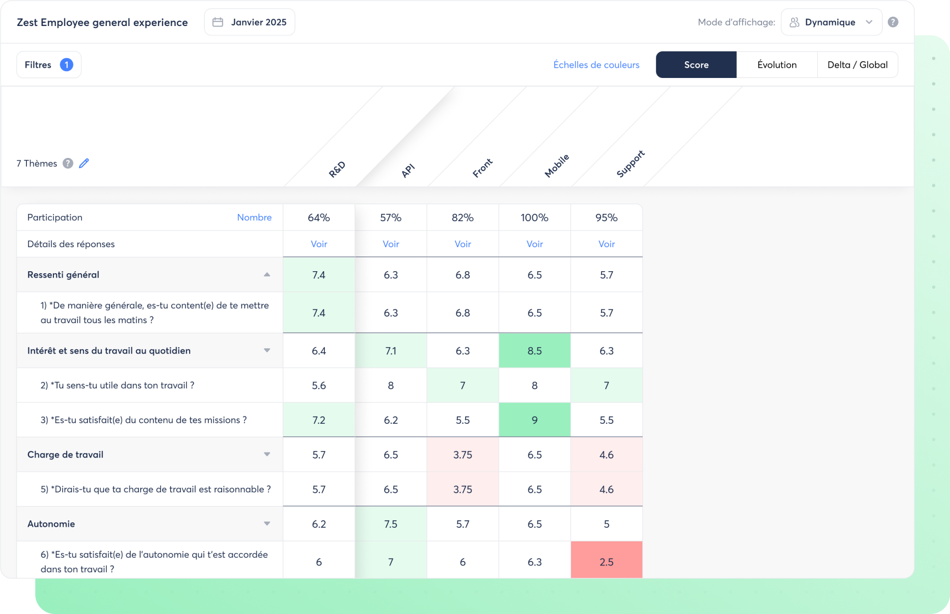
The Heatmap presents the results visually using color codes, allowing you to compare your populations at a glance.
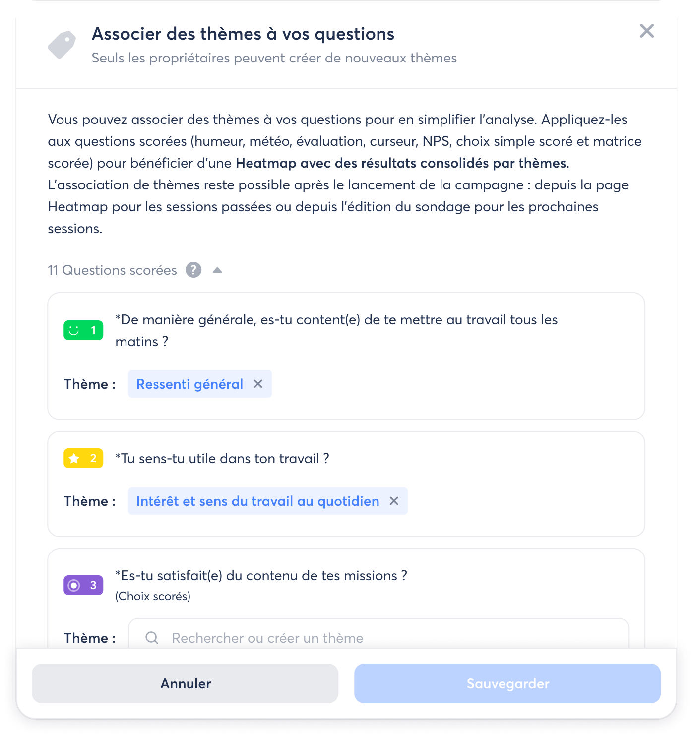
By associating themes with your questions (such as Recognition or Workload ), you benefit from a Heatmap with results consolidated by theme for even more actionable analysis.
The advantages of the Heatmap:
- Effortlessly study results from large areas and compare up to 50 populations at once
- Quickly identify, by population, the themes to work on as a priority and those to promote.
- Having a report format that is easy to share with your team or management
How does it work?
👉 Access the Heatmap from your survey results page.
👉 For each session, you will find 3 Heatmap visualizations: Score , Evolution (differences compared to the results of the previous session) and Delta / Global (differences compared to the overall results).
👉 To benefit from the Heatmap by theme , associate themes with your scored questions when creating your survey or from the Heatmap page. Choose from the QVCT themes already provided by Zest or create your own.