🗺️ How does the Heatmap work in Zest?
The Heatmap transforms an interview campaign into a colour grid so you can analyse your results at a glance. While the named list in the Participation tab is used to monitor the campaign day-to-day, the heatmap is used to analyse it: compare teams, spot a weak signal, and decide what to do next.
This guide explains how to read it, how to interpret it accurately, and how to use it to take action.
🎯 The promise — In 10 seconds, you should see: where things are slipping (a low score, a colour), what is still partial (an ongoing campaign), and be able to drill down to an individual employee in one click.
1. Where to find the heatmap?
The heatmap lives inside an interview campaign, in a dedicated tab, next to the Participation tab.
Add a screenshot showing where to find the heatmap from the Campaign Management page
- Participation — operational tracking: who did what, who to follow up with.
- Heatmap — analytical reading: aggregated results, in colour.
Both tabs share the same population scope: if you filter on three teams in one, you'll find them in the other. You can switch between tabs without losing your selection.
💡 Good to know — The heatmap is reserved for HR and Manager profiles. Employees consult their own interview in their personal space: they do not have access to this aggregated view.
2. The anatomy of the grid
The heatmap is a grid: questions in rows, populations in columns.
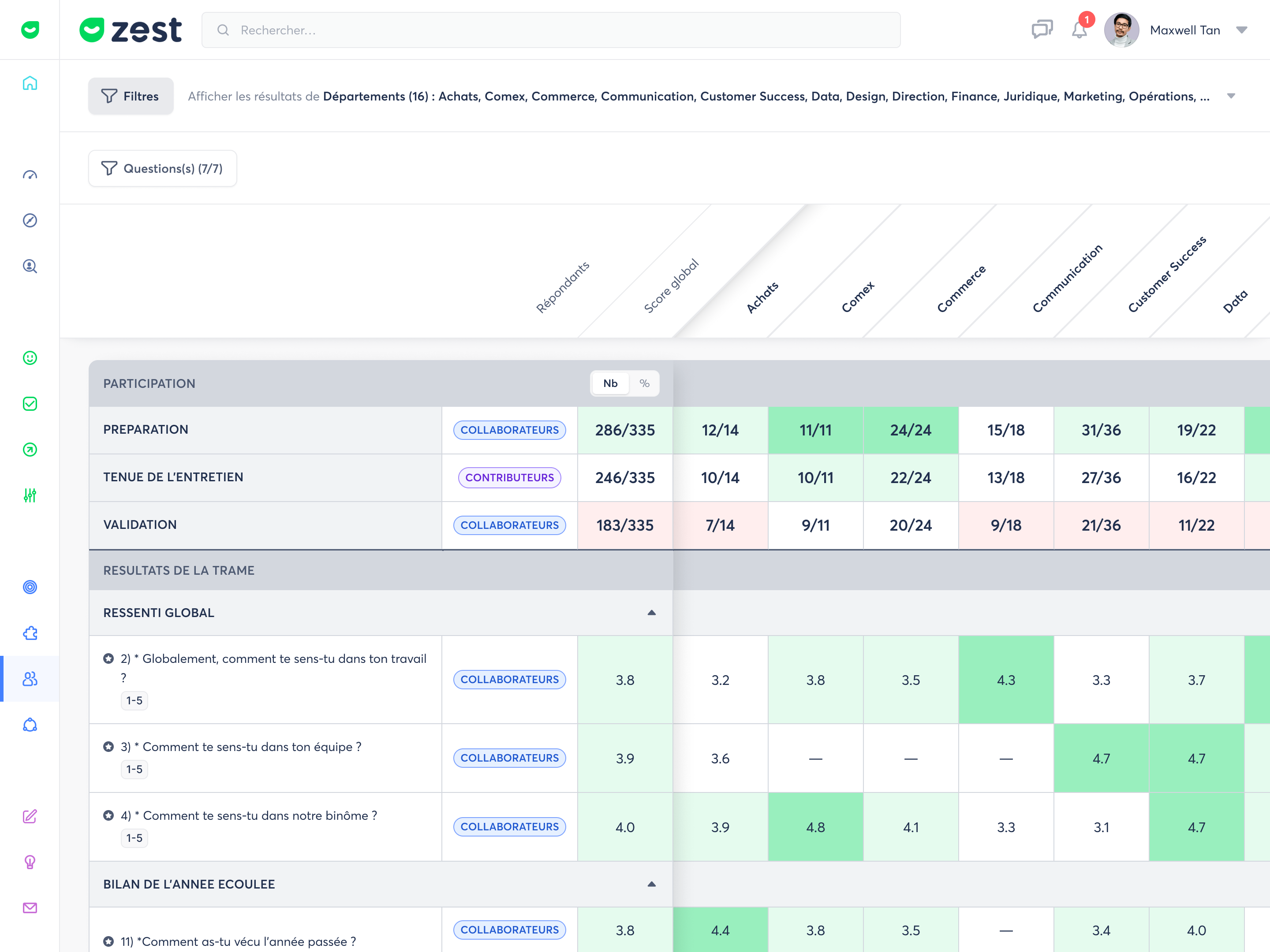
At the top, the "Participation" zone — one row per period (Preparation, Interview, Validation): this shows campaign progress.
Below, the "Results" zone — the questions from your template, grouped by section (e.g. Overall feeling, Review of the past year).
On the left, three anchor columns always remain visible as you scroll:
| Column | What it contains |
|---|---|
| Question | The question number and label, a scale badge (e.g. 1 – 5) and a ⭐ for key questions ("stars"). |
| Respondents | Who is concerned by the row: the Employee, the Contributors, or both. |
| Overall score | The campaign average — your reference point for situating each column. |
Then come the data columns: one population (department, team…) per column.
3. The two views of a cell
This is what makes interviews distinctive: each cell can stack two views on the same question — the employee's and the contributors'.
Screenshot of the 2 views
| Side | Who responds | What the value shows |
|---|---|---|
| Employee | The person being assessed (self-assessment) | Their score (or the average of employees in the column) |
| Contributors | The assessors: manager or other contributors | The average of contributor responses |
💡 Each question does not necessarily apply to both views.
The "Respondents" column indicates, row by row, which views are expected — only those will appear in the cell.
The two views are coloured independently, each according to its own value. The point isn't the score in isolation: it's the gap between the self-assessment and the contributors' assessment. An employee who rates themselves noticeably higher (or lower) than their contributors is a signal worth exploring in the interview.
4. Reading the colours
Each side of a cell takes a colour based on a threshold, on a 5-level scale from red (low) to green (high), with a neutral white in the centre.
| Threshold | Colour | Meaning |
|---|---|---|
| Very low | Dark red | The alert point |
| Low | Light pink | Below average |
| Average | White | Neutral — intentionally faded to let the rest stand out |
| Good | Light green | Above average |
| Excellent | Dark green | The strong point |
🎨 White is not empty — it is an average result, intentionally discreet so your eye goes straight to the red (to address) and the green (to highlight).
Thresholds adapt to question types: a score out of 5, an objective completion percentage, or a recommendation score (NPS) do not have the same boundaries.
Threshold detail by measurement type
a) Scores out of 5 (feelings, skills) — neutral midpoint around 3.
| Threshold | Range |
|---|---|
| Very low | 0 – 1.7 |
| Low | 1.8 – 2.5 |
| Average | 2.6 – 3.3 |
| Good | 3.4 – 4.1 |
| Excellent | 4.2 – 5 |
b) Objectives (%) — completion rate, with dedicated labels (can exceed 100%).
| Threshold | Range | Label |
|---|---|---|
| Very low | below 60% | Not achieved |
| Low | 60 – 79% | Partially achieved |
| Average | 80 – 99% | Achieved |
| Good | = 100% | Fully achieved |
| Excellent | above 100% | Exceeded |
📌 Objectives particularité — only 100% and above turns green. A rate of 80–99% stays neutral ("Achieved", white): it's done, but not exceeded.
c) Participation rate (Preparation / Interview / Validation rows) — no neutral midpoint: the higher, the better.
| Threshold | Range |
|---|---|
| Very low | below 50% |
| Low | 50 – 69% |
| Average | 70 – 84% |
| Good | 85 – 94% |
| Excellent | 95 – 100% |
d) Slider (0–10) and NPS / eNPS are also handled, with their own boundaries. A scale configured differently is mapped to the 5 generic thresholds (Very low → Excellent).
⚪ "Neutral" metrics are never coloured — some measures have no good/bad axis (for example "proportion of employees who requested training"). They display as a value only, with no colour: it is information, not performance.
5. Tracking participation (as you go)
The "Participation" zone, at the top of the grid, tracks progress across 3 periods. The grid fills in as the campaign progresses.
| Period | What happens | Effect on the grid |
|---|---|---|
| Preparation | The employee fills in their self-assessment | The Employee side appears |
| Interview | Contributors (manager and/or peers) respond | The Contributors side appears |
| Validation (optional) | Review / sign-off | Results are locked |
🕐 Ongoing campaign — provisional results
While the campaign is not yet closed, a banner above the grid reminds you: not all interviews are complete, and figures will change until closure. This is normal — a cell not yet filled in displays "—".

🔢 Switch between % and headcount — the Participation band header carries a small No. ↔ % button: you toggle all rates from percentage ("88%") to headcount ("14 / 16" = respondents out of eligible). The colour does not change, only the number format.

6. Drilling down to an individual employee
The default view compares populations (one column = the average of a population). But you can analyse a population in detail to see each employee in a column. This is the heart of the analysis: moving from where to who.
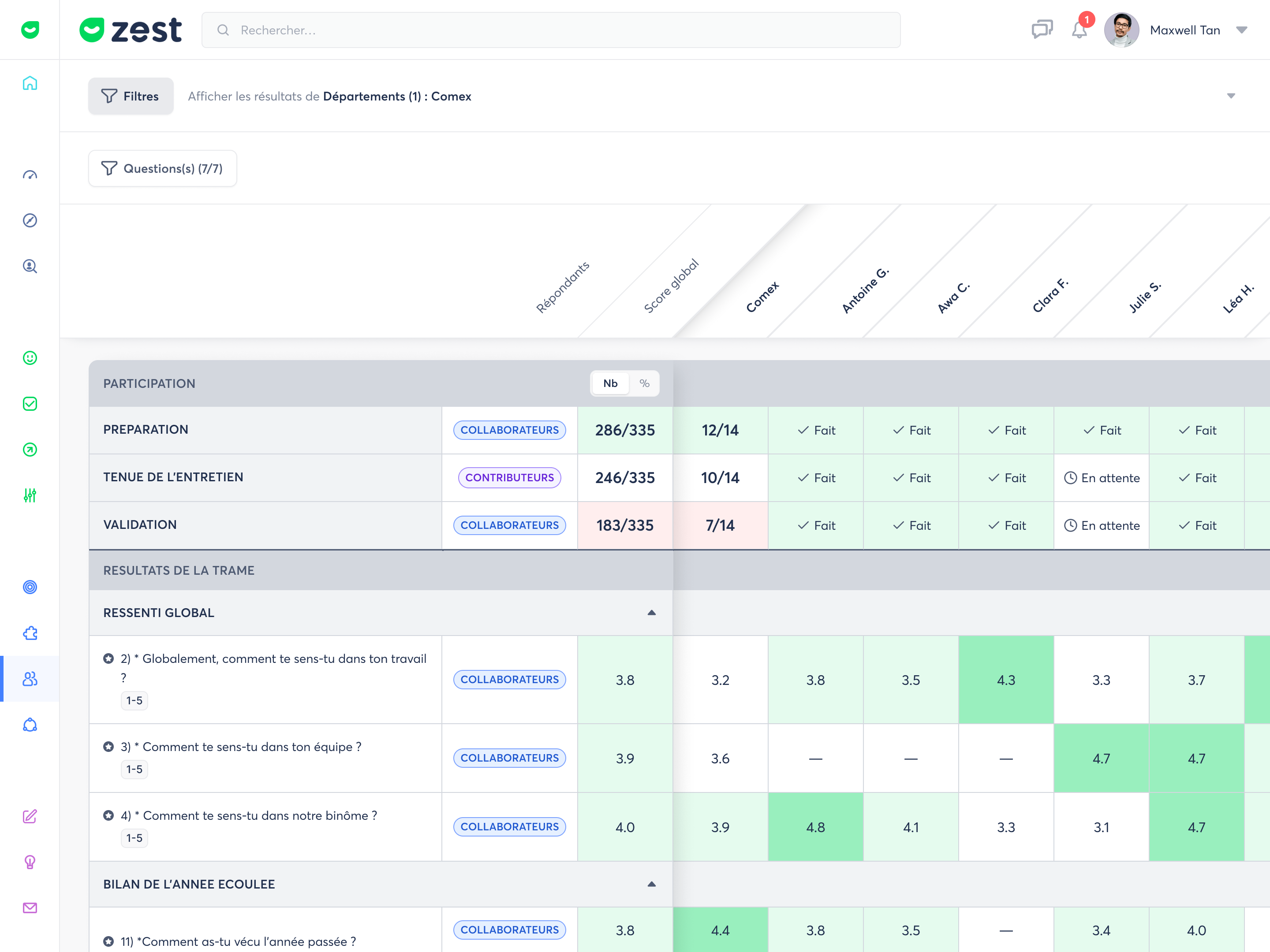
How to enter this view — in the filter, select "Break down a population". The columns then become the employees within that population.
Screenshot when clicking on the filter window
How to exit — reopen the filter and reselect at least two populations. There is no "back" button: it is the number of populations that drives the view.
📐 Two reference points to situate each person — in the individual view, two reference columns remain pinned: the average for the open team and the Overall score (the whole campaign). You can therefore read each employee both against their team and against the whole.
7. Filtering the heatmap
Two filters act on the grid and determine what it shows.
| Filter | Default | What it does |
|---|---|---|
| Populations | Your direct scope | The number of populations determines the view: several → comparison (one column each); one only → individual view (§6). |
| Questions | All displayed | You restrict the grid to the questions you need (e.g. your ⭐ questions). At 0 questions, the Results zone empties, but Participation remains. |
🛟 The scope always keeps at least one population — you cannot end up with "no population": a default scope is always guaranteed. Participation tracking is always displayed, no matter what.
❓ The Questions filter, in detail — by default, all questions applicable to the heatmap (excluding open-ended, single-choice and multiple-choice questions, which cannot be aggregated) are shown in the grid. The filter then lets you enable or disable each question individually, to keep only those relevant to your analysis.
8. The method: a good analysis in 5 steps
A good heatmap reading always follows the same path, from general to specific.
- Check participation first. A score calculated on few responses is fragile. Scan the Participation band: if rates are low, read the results as trends, not facts.
- Let the colours guide you. Don't read everything: look for red / pink (what's slipping) and dark green (what's shining).
- Compare the columns. The same question red for one team and green for another signals a gap between populations to understand. The Overall score is your benchmark.
- Read the gap between the two views. On the same cell, compare the Employee side and the Contributors side. Aligned = shared perception. Very different = a topic to put on the table.
- Drill down to the individual level to know who to act on, then move to action.
⚠️ Watch out for "partial" results — a cell marked as partial signals that only one side has responded, or that not all expected responses are in yet.
9. Best practices
- ✅ Always read the participation rate before the scores — a nice green on 3 responses is not worth a green on 60.
- ✅ Think in relative terms, not absolute — situate each column against the Overall score rather than judging an isolated figure.
- ✅ Focus on key questions — filter on your ⭐ questions for a quick first read, then broaden.
- ✅ Treat the Employee / Contributors gap as a starting point for the interview, not as a verdict.
- ✅ Wait for closure before making significant decisions — during the campaign, figures are provisional.
10. Frequently asked questions
❓ Why don't some questions from my template appear?
The heatmap compares averages. Open-ended questions (free text) and single/multiple-choice questions cannot be aggregated: they are therefore excluded. In that case, the heatmap displays "not applicable" — but participation tracking remains available.
❓ Why is a cell white / without colour?
Either it is an average result (intentional neutral white), or it is a neutral metric (with no good/bad axis, never coloured). A "—" means "no response yet" or "period not yet started".
❓ Who can view the Heatmap?
HR sees their entire scope, down to individual detail. The manager sees the detail of their team. Employees do not have access to the heatmap.